The goal for HYFN8 is to make social marketers more efficient at delivering meaningful results for their business by bringing value to marketers along each step of their advertising journey, by creating unique solutions, improving efficiencies and innovating features set HYFN apart from the competition and be a true cross-channel platform.
A much needed re-boot for the product was inevitable; bloated and obsolete features, changing needs in the market and workflow inefficiencies required an investment to re-imagine the product. This prompted an organization shift where I would lead the newly created design team for our product division. Our task was to revamp the tool to focus more on the user needs of today and innovate the features that they will find useful tomorrow.

TEAM
The core design team was made up of myself and a senior level user experience designer. We worked closely with our product managers and Vice President of tech to bring the product to life. Our approach was to use a Human Centered Design process and keep our users at the forefront of our decision making.
I am responsible for the design vision & user experience for the product as well as hiring and managing the team. My role also included creating a workflow and process to help the design team collaborate with each other and with our other teams.

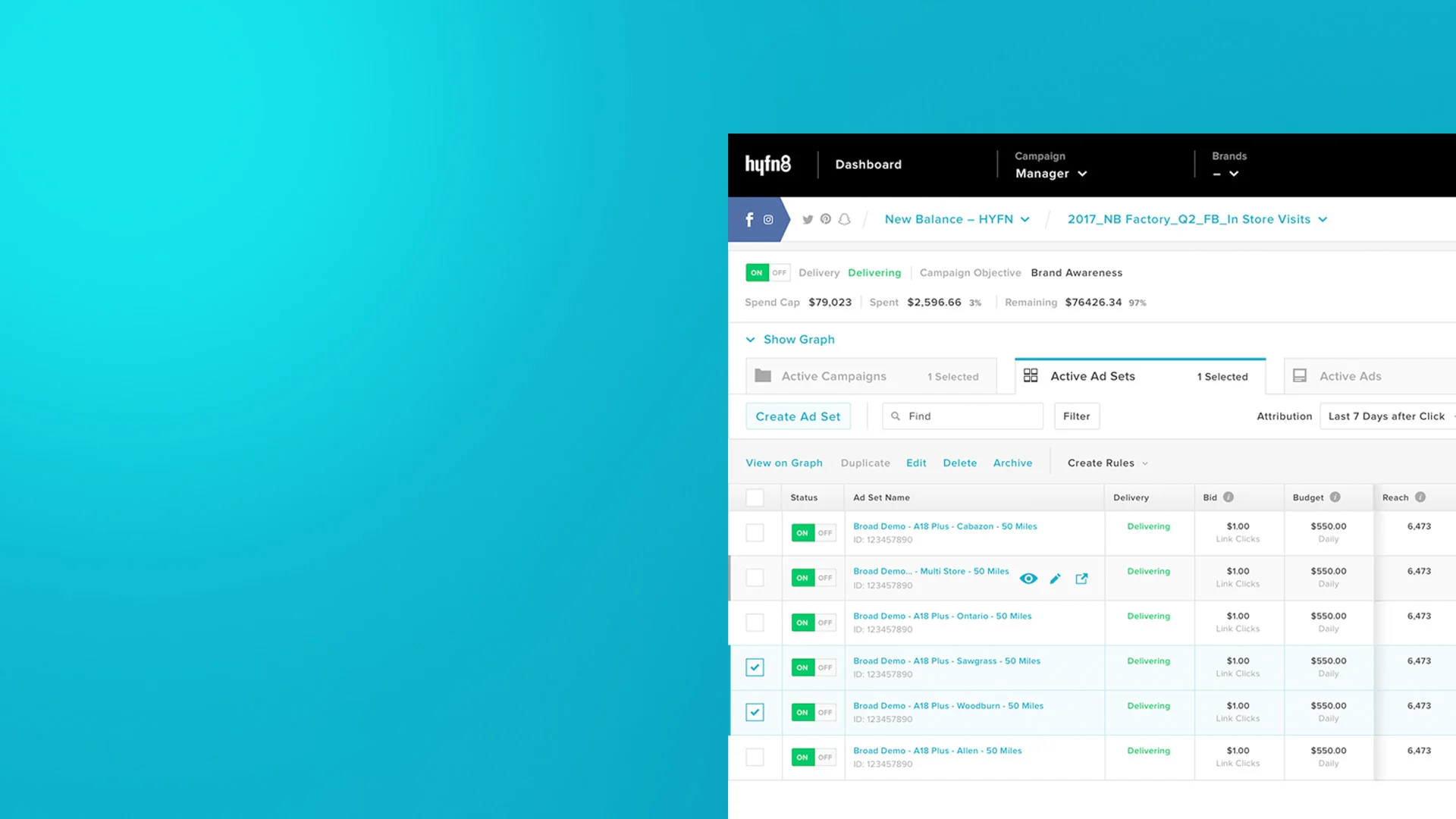
Previous User Interface

Early mockup to display what the interface could look to get buy-in from the stakeholders
RESEARCH
Our research started with taking a look at the landscape and it gave us a better understanding of the current state of the industry. We also interviewed and observed our current users to see what their main tasks and pain points were. In addition, we ran a survey on various topics to gather data that will help us in the design process.
KEY INSIGHTS
Our competitors mostly focused on Facebook only
46.30% of users found the product somewhat satisfying, while only 12.80% found it very satisfying
25% of users felt that the HYFN8 was unreliable
The most frustrating issues were: loading issues, slowness, lack of features, buggy and the UI is dark & clunky
64.3% would like to access the tool with mobile devices to check on how campaigns are performing
THE USERS
We interviewed three main job functions. Client Services, Media Buyer (Ad Trafficker) and Analyst. Each used HYFN8 in a different way and we gathered a deeper understanding of their day-to-day relationship with the product. We received feedback on what is frustrating with the product as well as ideas to improve the product.

Example of the finding from the survey
PRIMARY PERSONAS
Goals
Get accurate information to report to the client
Optimize spend by managing campaign budgets
Offer the clients insights based on campaign performance
Frustrations
HYFN8 is hard to navigate
Load times and bugs
Not being able to get data quickly and easily
SECONDARY PERSONAS
Goals
Explain to clients why they should use our managed service
Accessing metrics for sales materials
Frustrations
HYFN8 doesn't leave a great first impression
Pulling information is slow
Interface is intimidating
An example of one of the personas
CREATING A PLAN
Armed with user feedback and data, we started by streamlining the information architecture. The current structure was hard to navigate and cumbersome to use. To help us organize the information, we conducted a card sort to help us group features as well as audit the current IA. Our findings helped us structure the sitemap. Since the navigation issues of the site was one of the most common frustrations, we needed to get this right.

Once we developed a sitemap we had a series of whiteboard sessions to mold the basic structure of the site. I then tasked the team to create versions of the campaign manager, which is the most used section of the app. We regrouped and discussed the pros and cons of the mockups. Then I created wireframes based on the strongest ideas in Sketch then took the wireframes and created a prototype with InVision.
Proposed Sitemap
Testing the prototype gave us insight in what the users expected to see based on experience with other products. It also showed any weakness in our thinking. After a couple rounds of iterations, we moved forward with developing wireframes for the rest of the site and testing along the way.
A collection of documentation from the personas, card sort test result, survey findings and user flows
Wireframe examples

Annotated wireframes
VISUAL DESIGN
The current state of the visual design was in need of an overhaul. Our data uncovered that the users had a hard time with the dark interface. The sales team also noted that clients had feedback that the tool was unattractive.
Our approach to visual design was to build a system that makes design and development quicker to execute. The ability to execute quickly gives HYFN an edge in the marketplace. The design system, DASH, is now a standard for all of HYFN’s products.
We work with our engineering team to keep a living style guide. All of our products share the same library of components. It also provides value when working with contract development teams. The effort has affected the bottom line by saving HYFN time and money.

Example of how components from Dash can be reused for different HYFN products
RECAP
A large investment was made to redesign HYFN8. It’s goal was to make our users more operationally efficient as well as develop cross-platform features to differentiate us in the market. We heavily leaned on our users to help us define the tool. Currently the redesign is in the development phase and we plan to do user testing to improve the product throughout its lifecycle.
The effort has impacted the business in the following ways:
Users are excited and relieved with the new design
The feedback from sales of the tool being unattractive is addressed with the more modern look
It will open a possible new revenue stream with the option of selling the product as a SaaS tool
Proved that product design is an essential function of the HYFN product team
By improving efficiencies and cross-platform nature of the product, it will set HYFN apart from its competition
It has saved the company time and money with the development of the design system for any future product builds
Earned the Best Publishing Platform by Digiday